| industry | avg_gap |
|---|---|
| Retail | 8209 |
| Services | 12158 |
| Manufacturing | 8861 |
| Technology | 17238 |
Visualização de Dados
Treinamento em R
The Same Data as a Plot
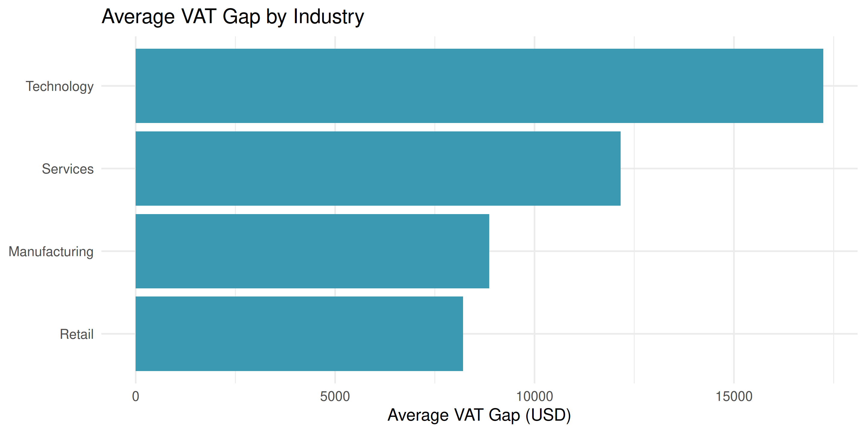
Now we instantly see: Manufacturing has the highest average gap!
Choosing the Right Chart
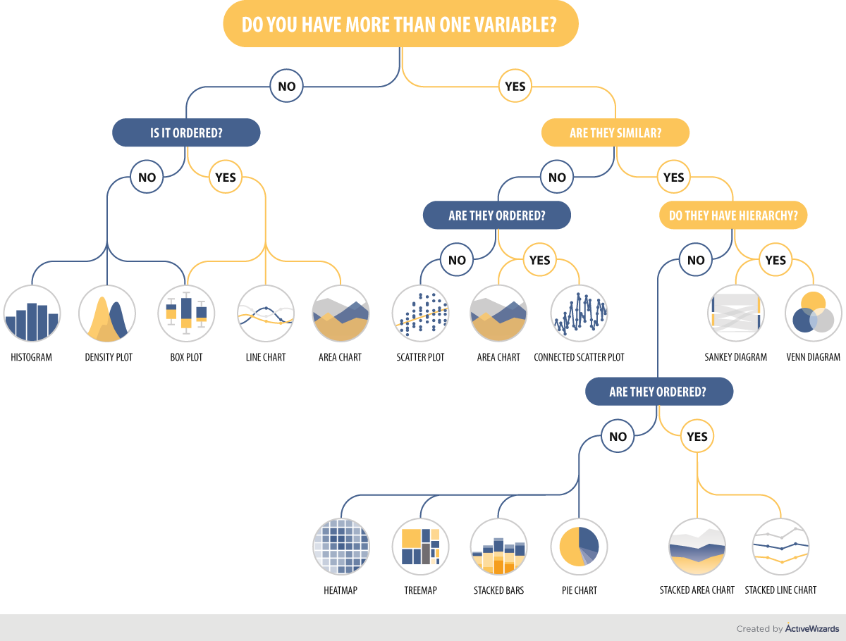
Source: ActiveWizards
Today’s focus: Bar charts, line charts, scatter plots
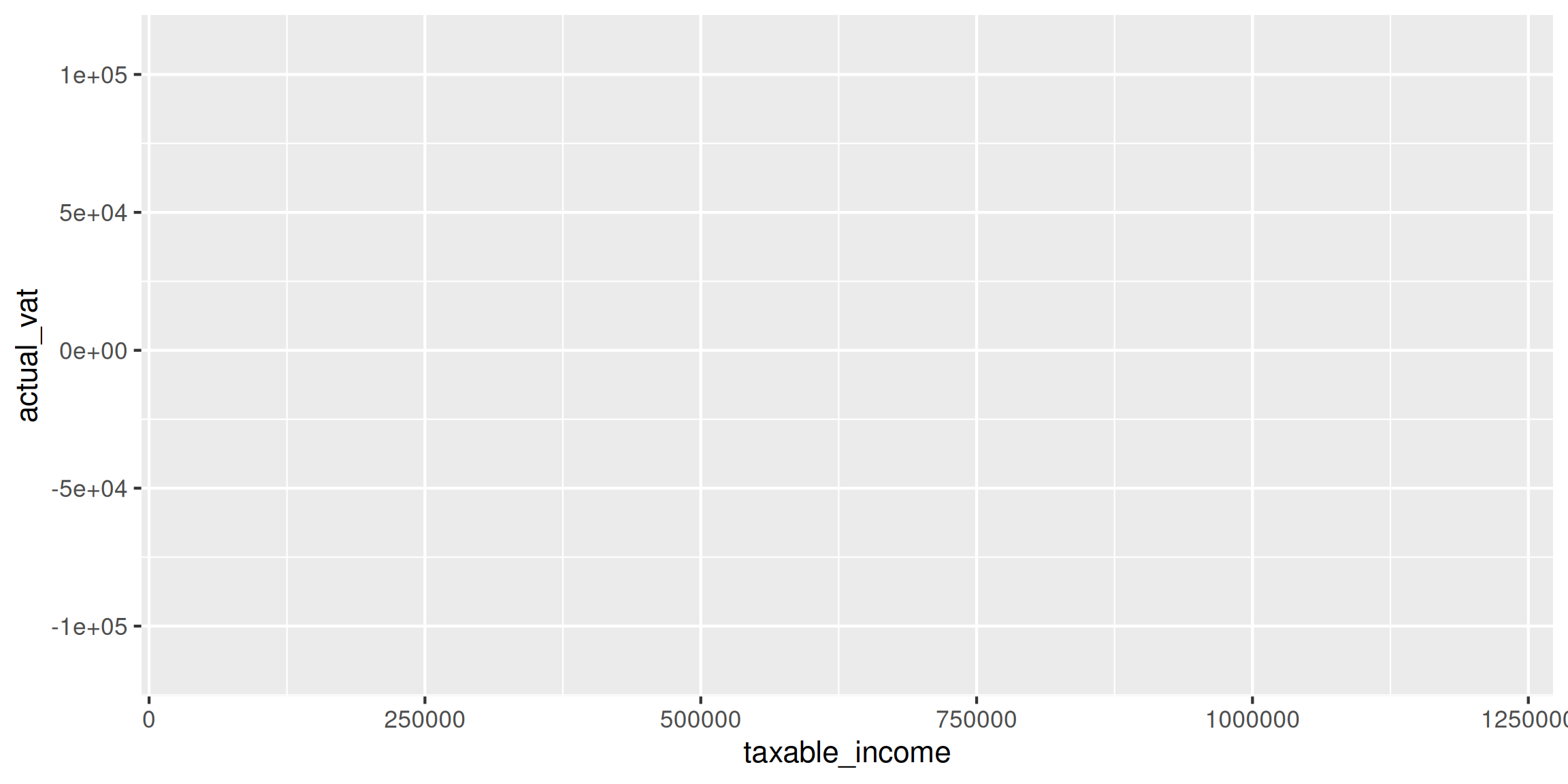
Building a Plot: Step by Step
Step 1: Tell ggplot what data

Empty gray box - ggplot is ready but doesn’t know what to plot
Building a Plot: Add Aesthetics
Step 2: Map variables to x and y
Now we have axes, but no data yet!
Building a Plot: Add Geometry
Step 3: Add geometric shapes
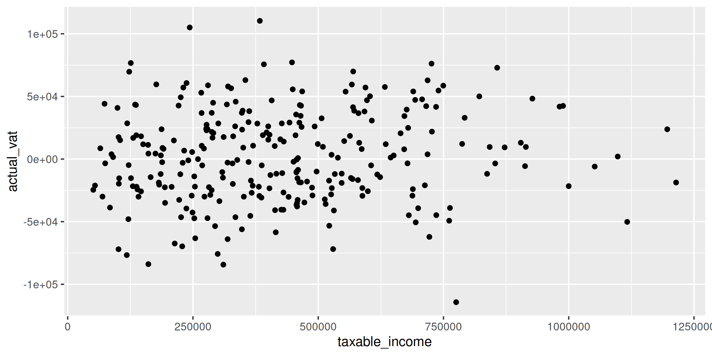
Complete plot! 🎉
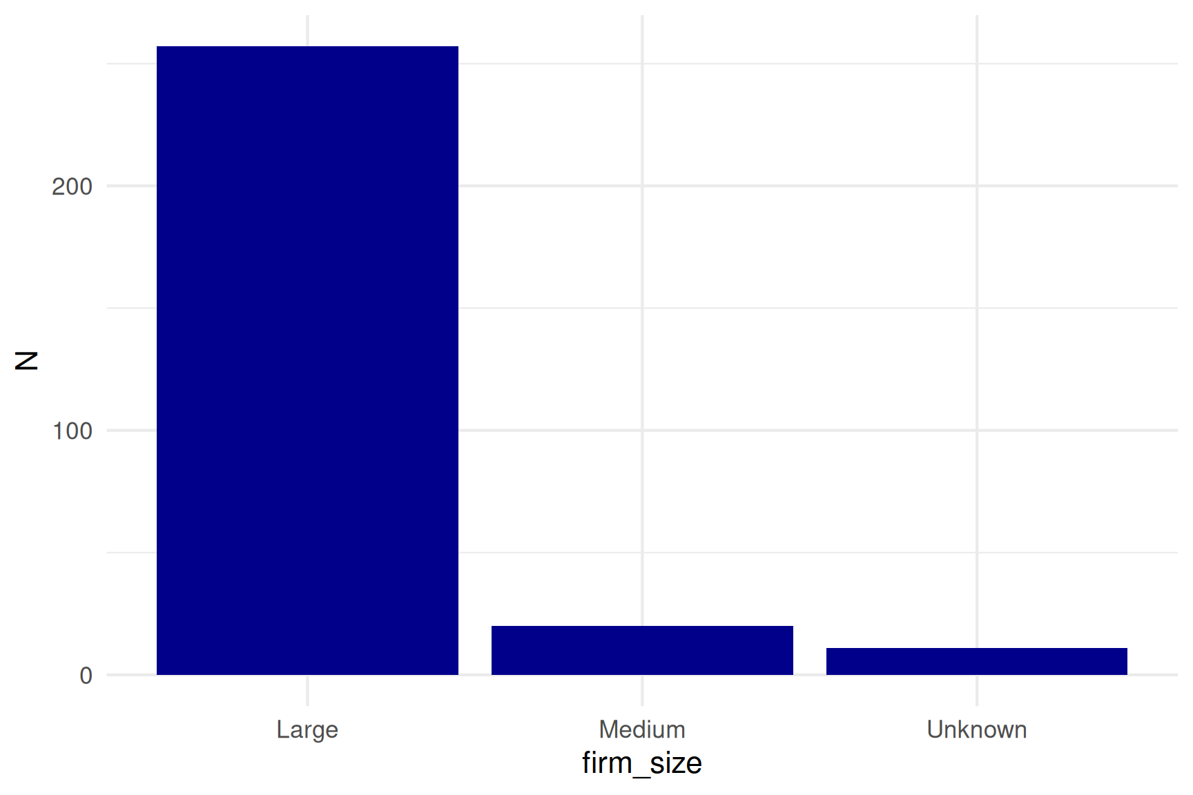
Position: x and y
The foundation of every plot:
Position tells: Which firm has what values
Color: Adding a Third Dimension
Color can show categories:

Now we see: Large firms (orange) cluster in top-right
Color vs Fill: Important Distinction
Different geoms use different aesthetics:
color - for points and lines:
Use color for geom_point() and geom_line()
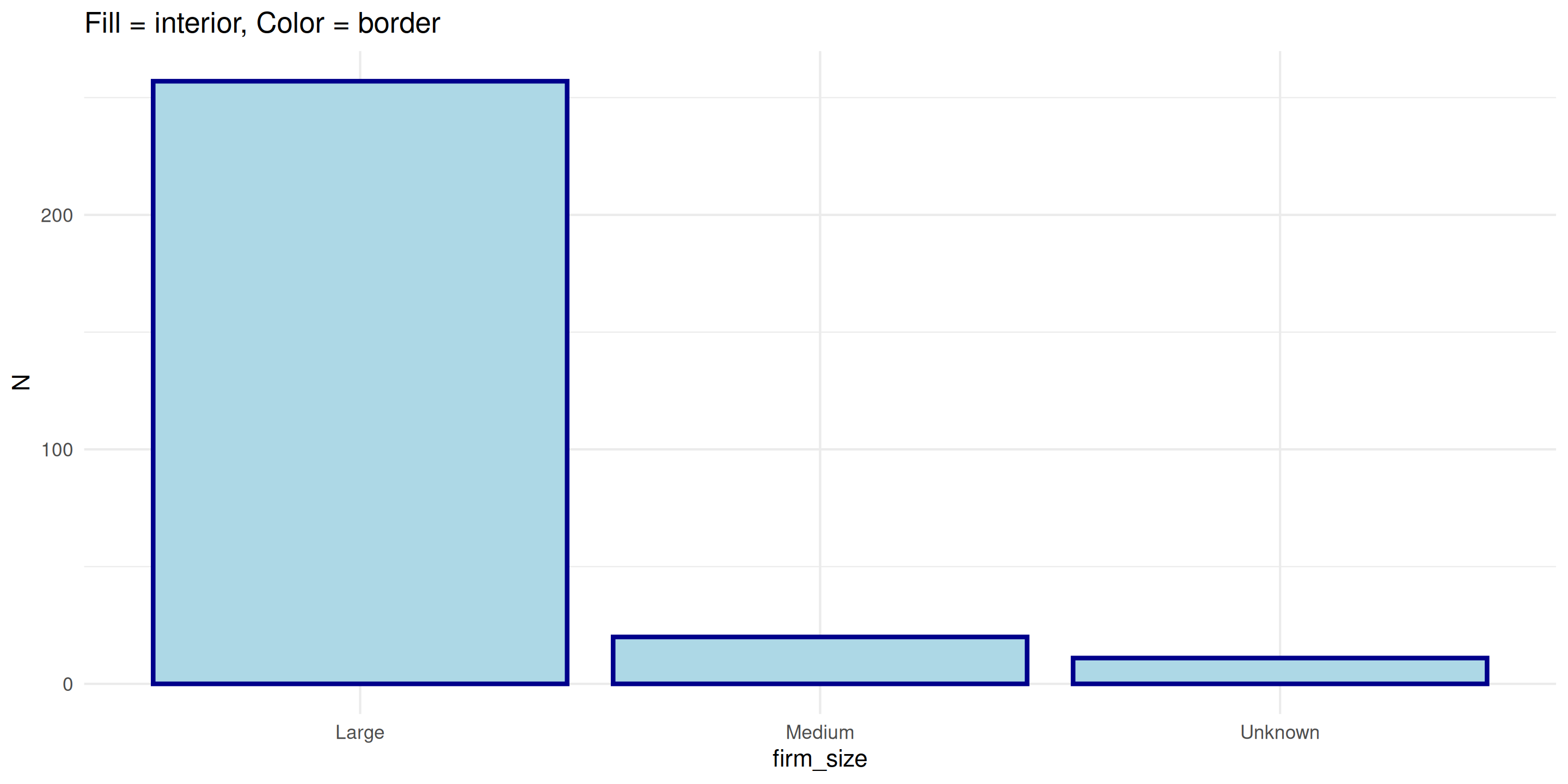
Color AND Fill Together
Bars can have both fill (interior) and color (border):
Dica
Quick rule: Points use color, Bars use fill
Variables go inside aes(), fixed values go outside:
Importante
If it’s in your data → use aes()
If it’s a fixed choice → outside aes()
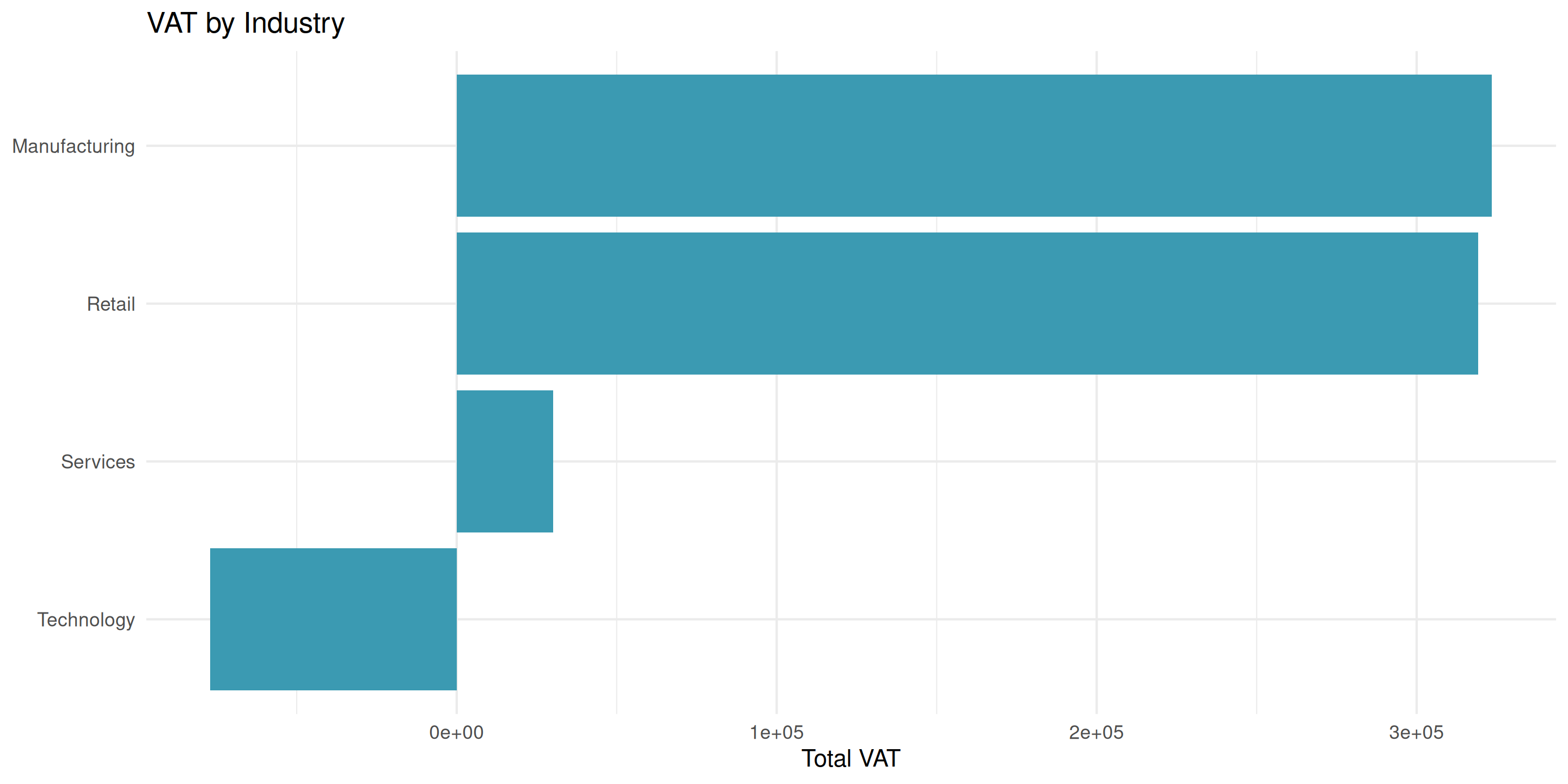
Bar Chart: Basic Example
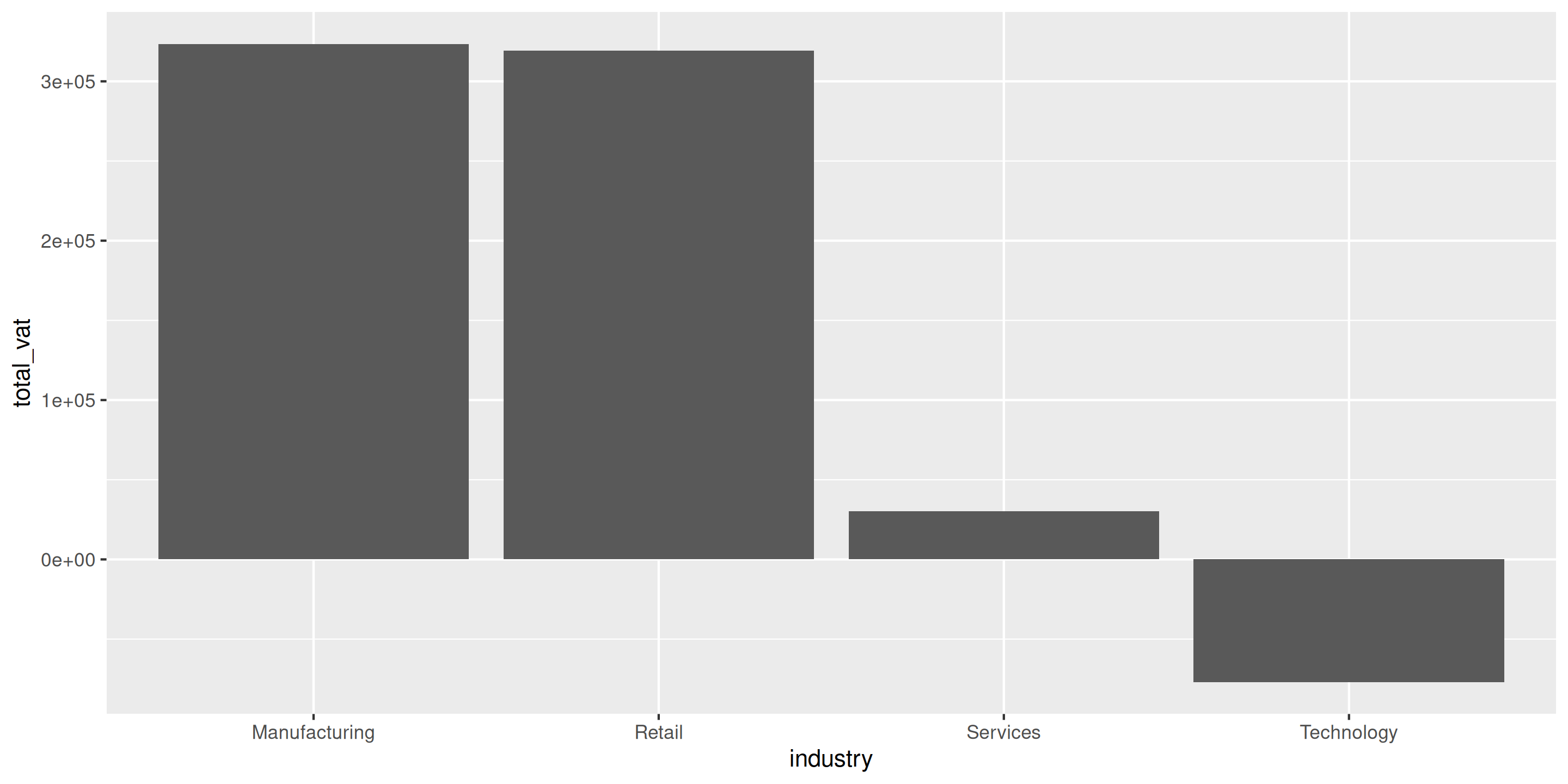
Problem: Hard to read vertical labels
Bar Chart: Make It Horizontal
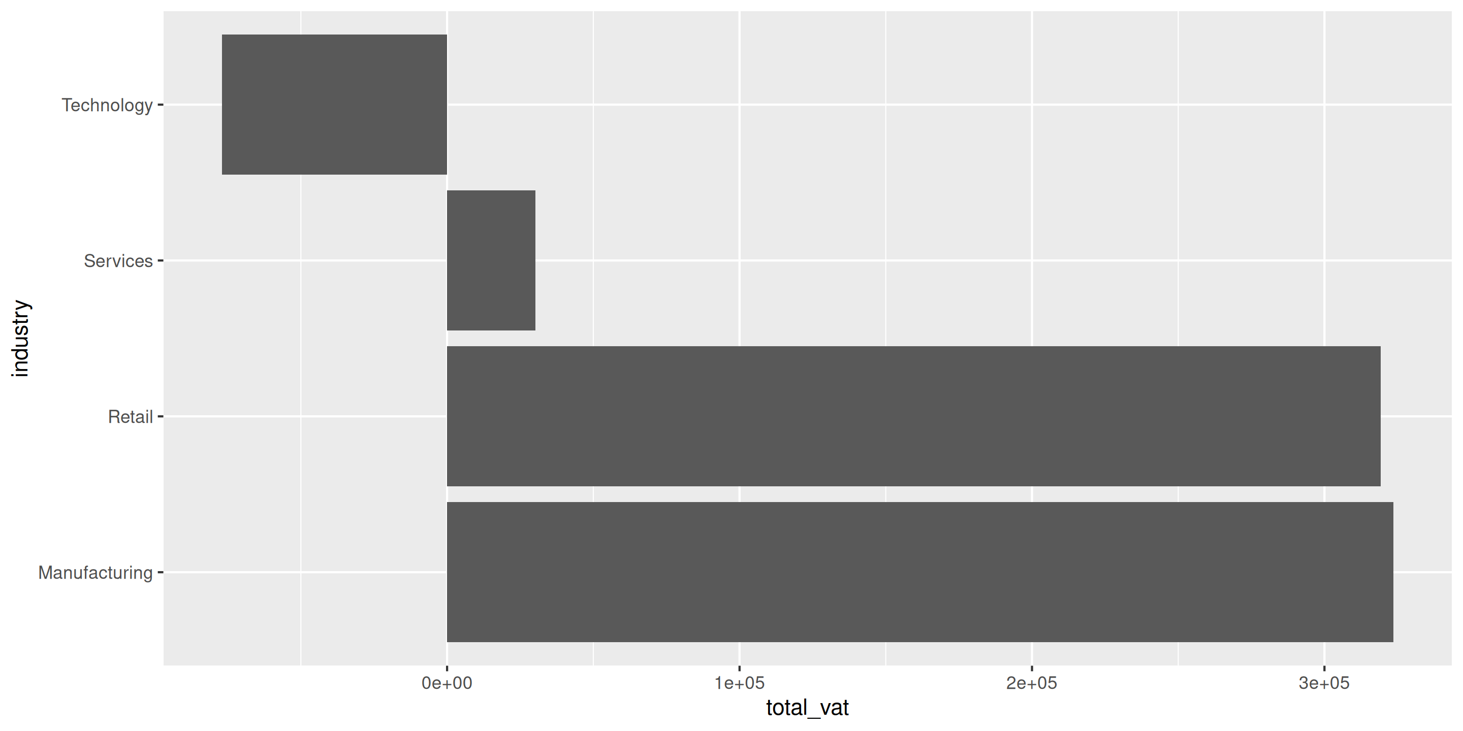
Much better! coord_flip() rotates the plot
Bar Chart: Sort by Value
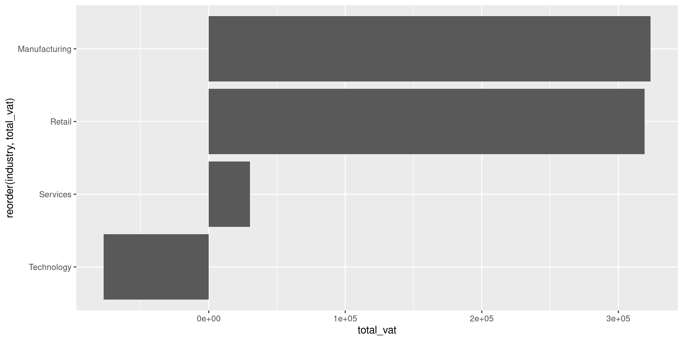
reorder(industry, total_vat) sorts industries by VAT amount
Bar Chart: Add Color and Labels

Grouped Bars: Comparing Multiple Categories
When you have TWO categorical variables:
Create side-by-side bars with position = "dodge":

Stacked Bars: Showing Composition
Show total AND breakdown with stacked bars:
ggplot(industry_size, aes(x = reorder(industry, total_vat), y = total_vat, fill = firm_size)) +
  geom_bar(stat = "identity", position = "stack") +  # position = "stack" is default
  coord_flip() +
  labs(
    title = "VAT Collection by Industry (by Firm Size)",
    x = NULL,
    y = "Total VAT (Millions USD)",
    fill = "Firm Size"
  ) +
  scale_fill_brewer(palette = "Set2") +
  theme_minimal()
Each bar shows total, colors show contribution from each firm size
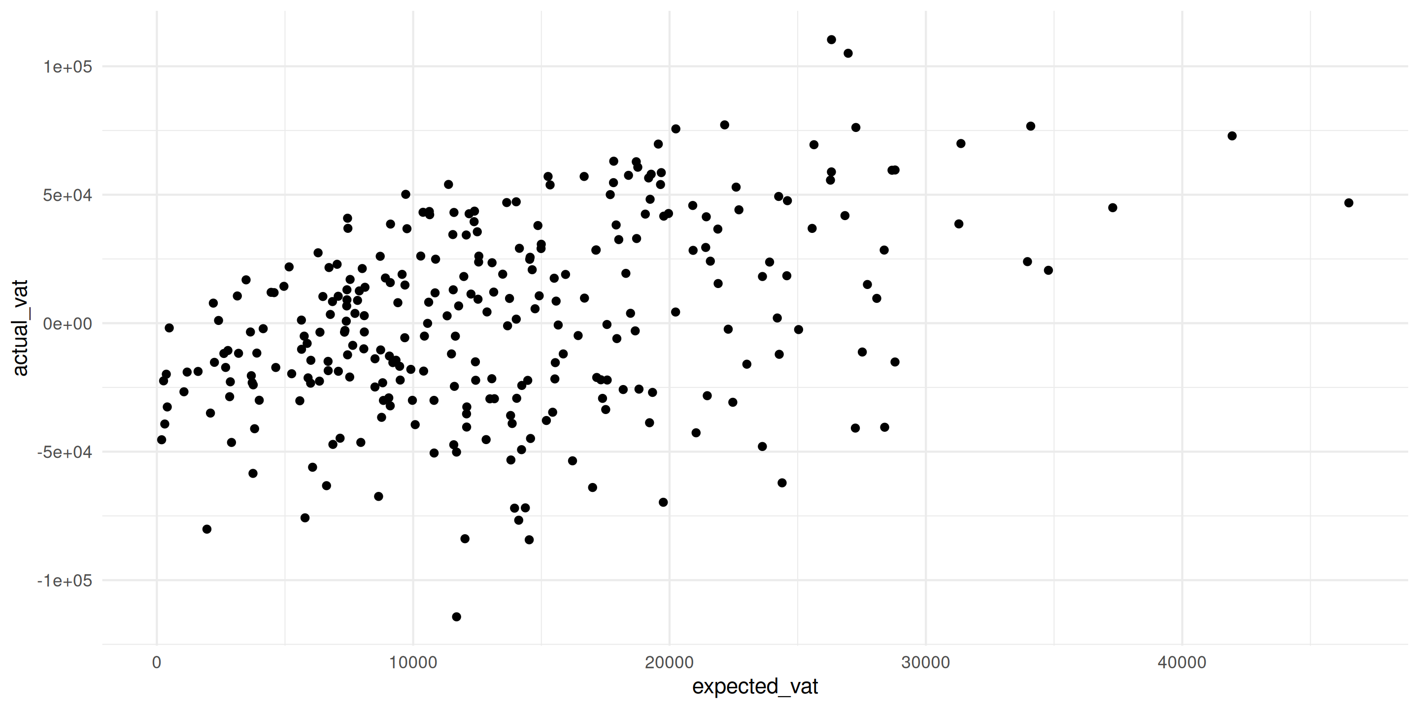
Scatter Plot: Basic Example
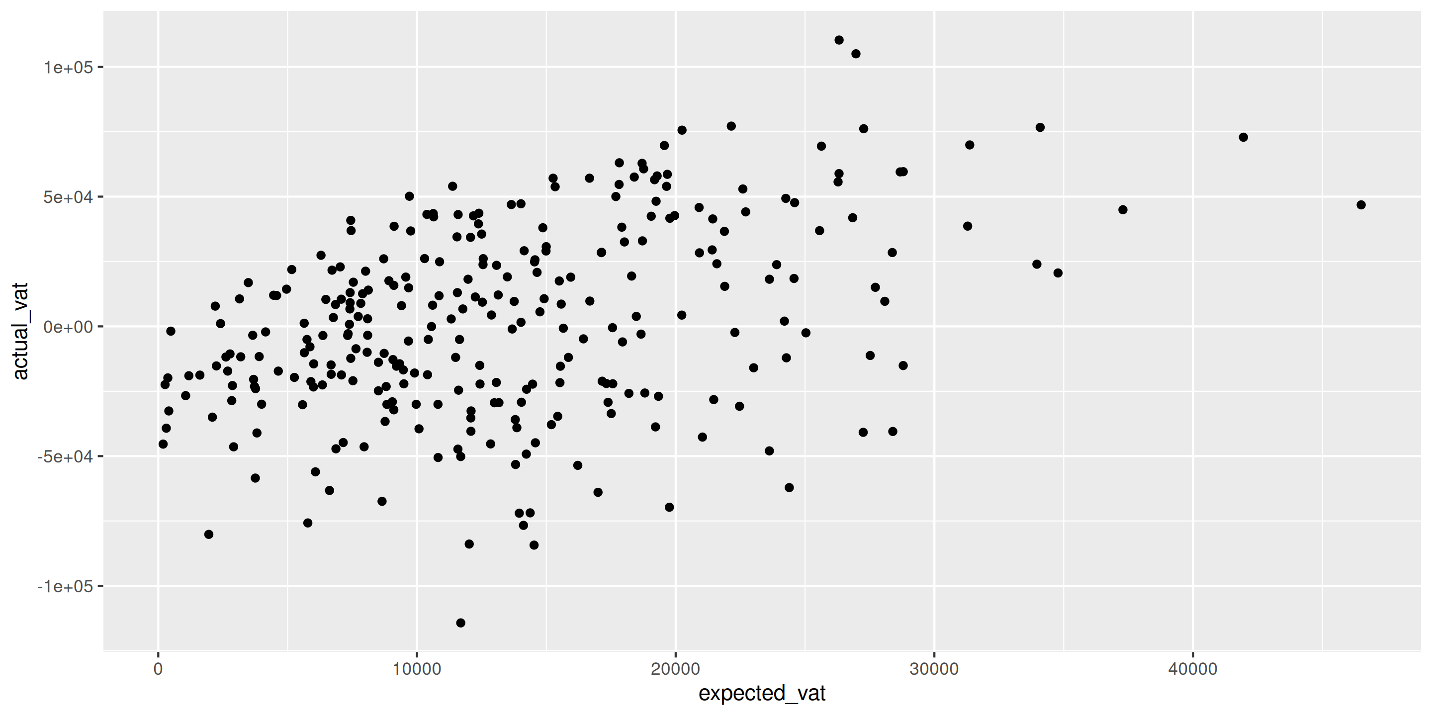
Shows relationship between expected and actual VAT
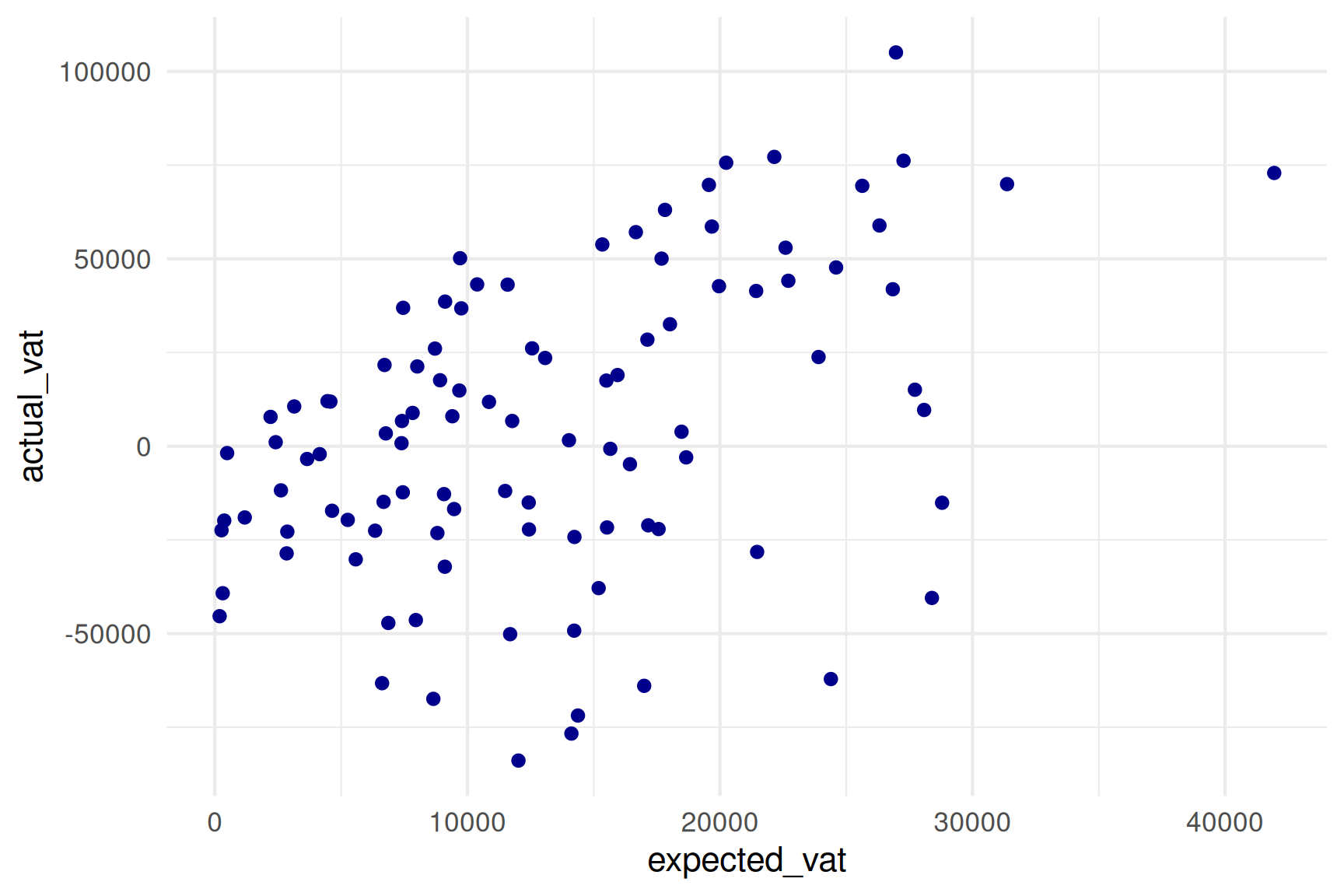
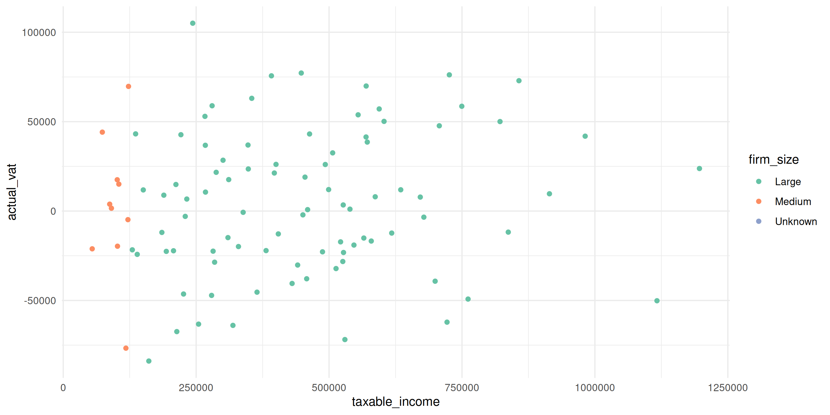
Scatter Plot: Add Color for Groups
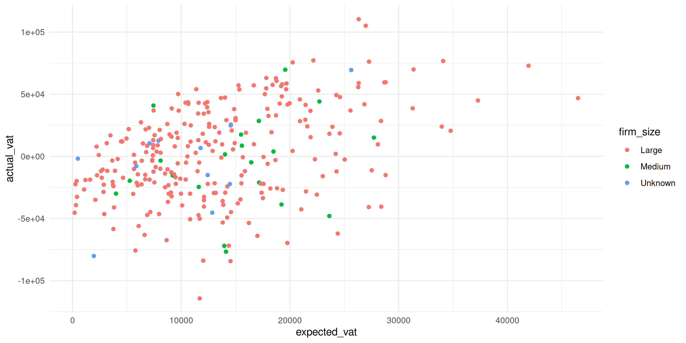
Now we see: Pattern differs by firm size
Scatter Plot: Add a Reference Line
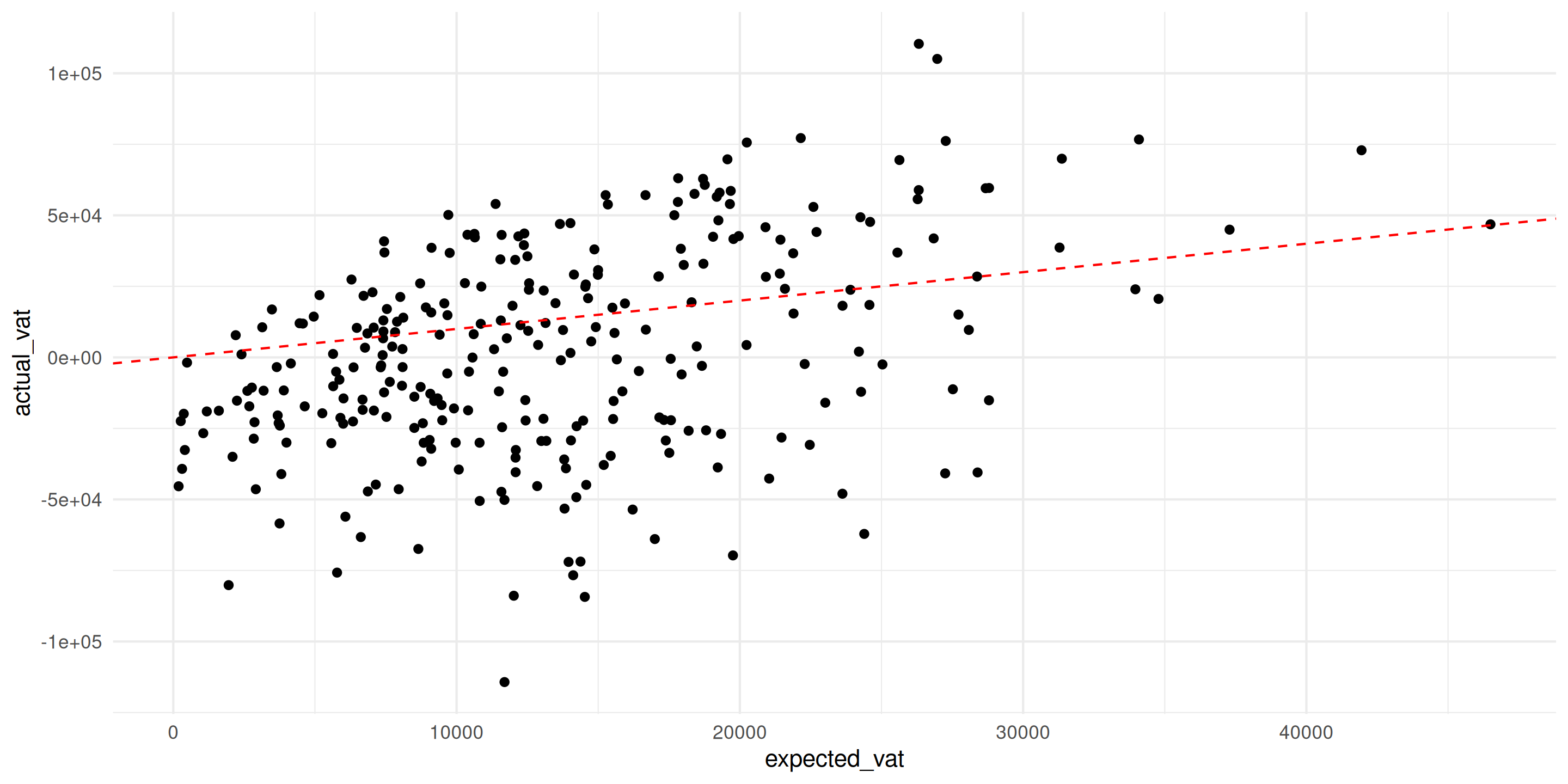
Red line shows perfect compliance (actual = expected)
Scatter Plot: Add a Trend Line
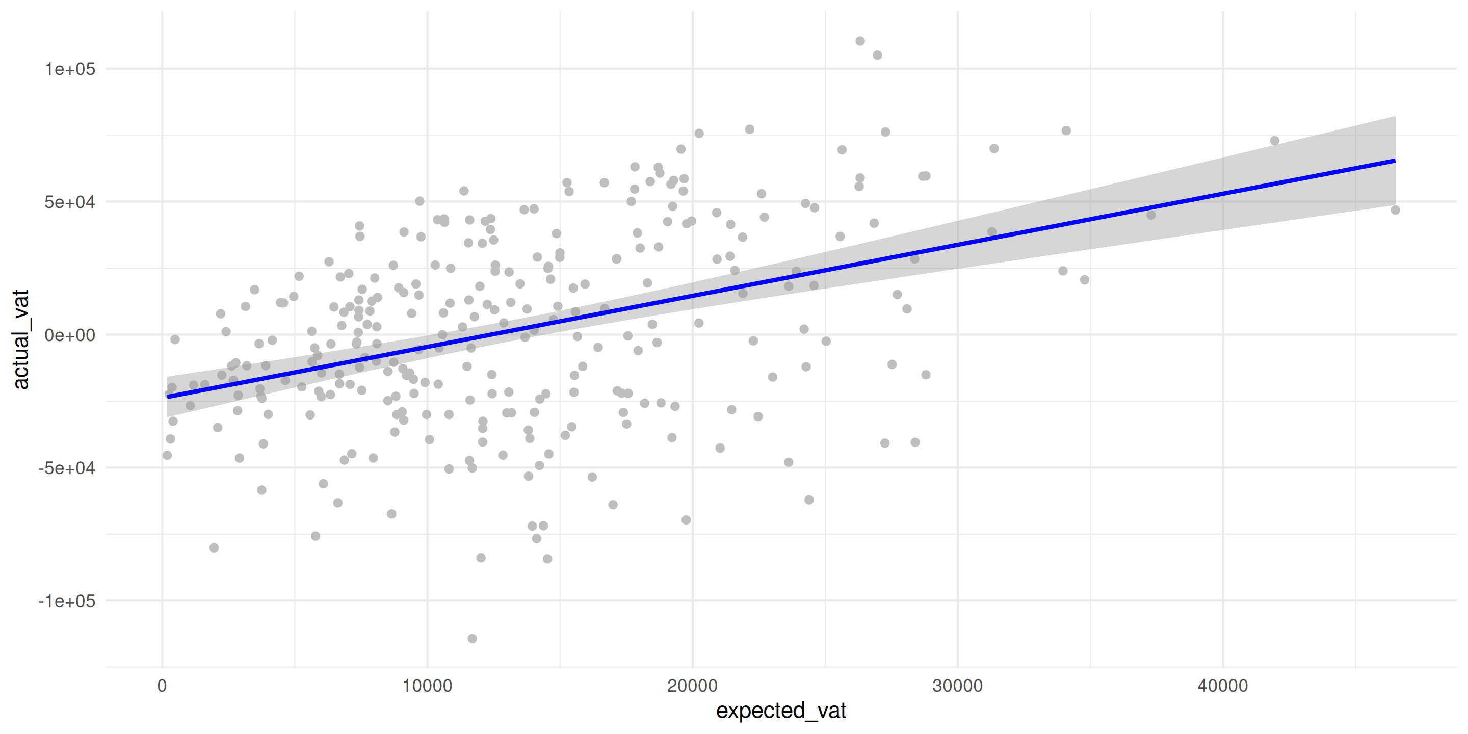
geom_smooth(method = "lm") adds linear trend line
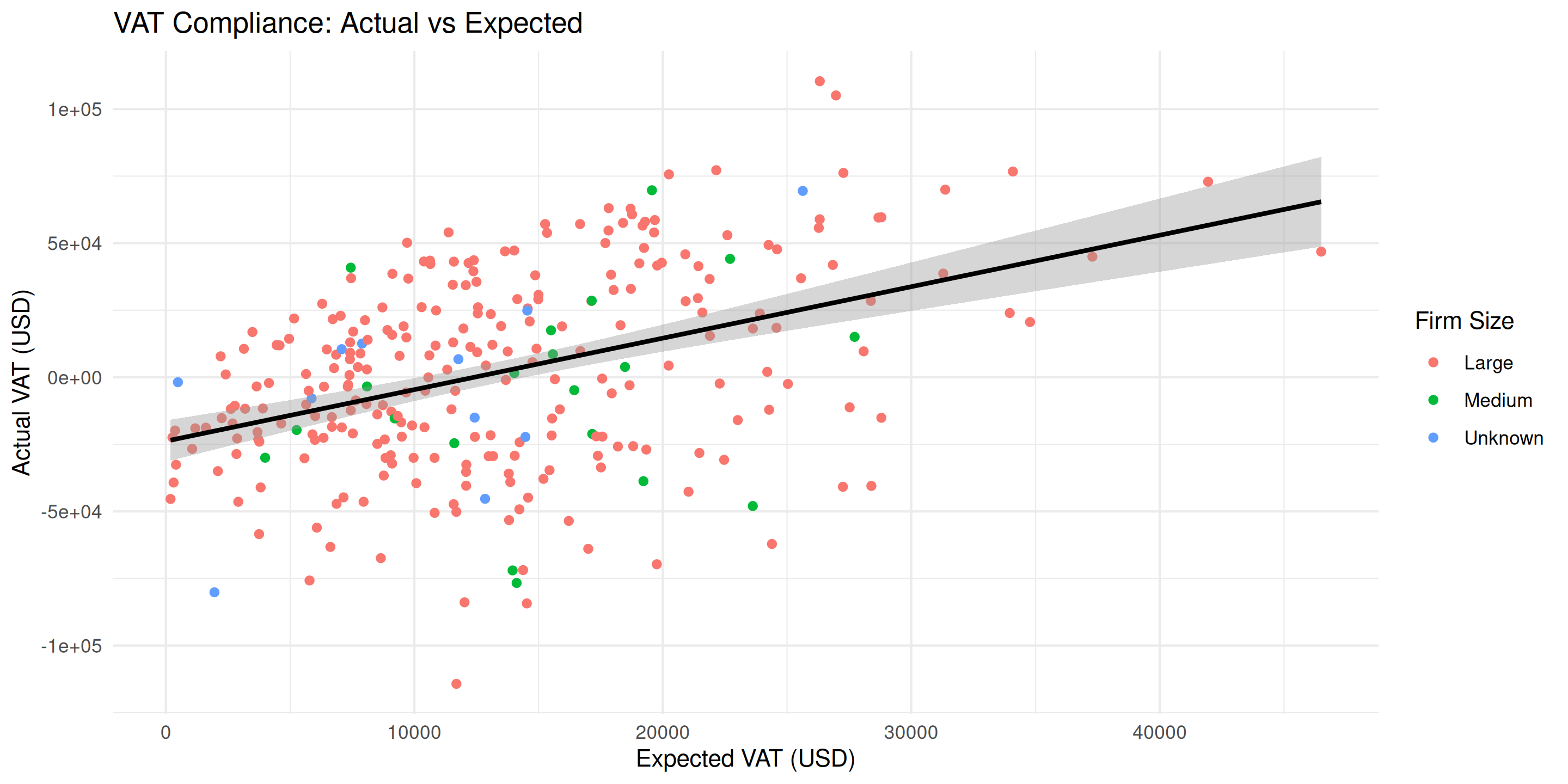
Scatter Plot: Professional Version
Line Chart: Basic Time Trend
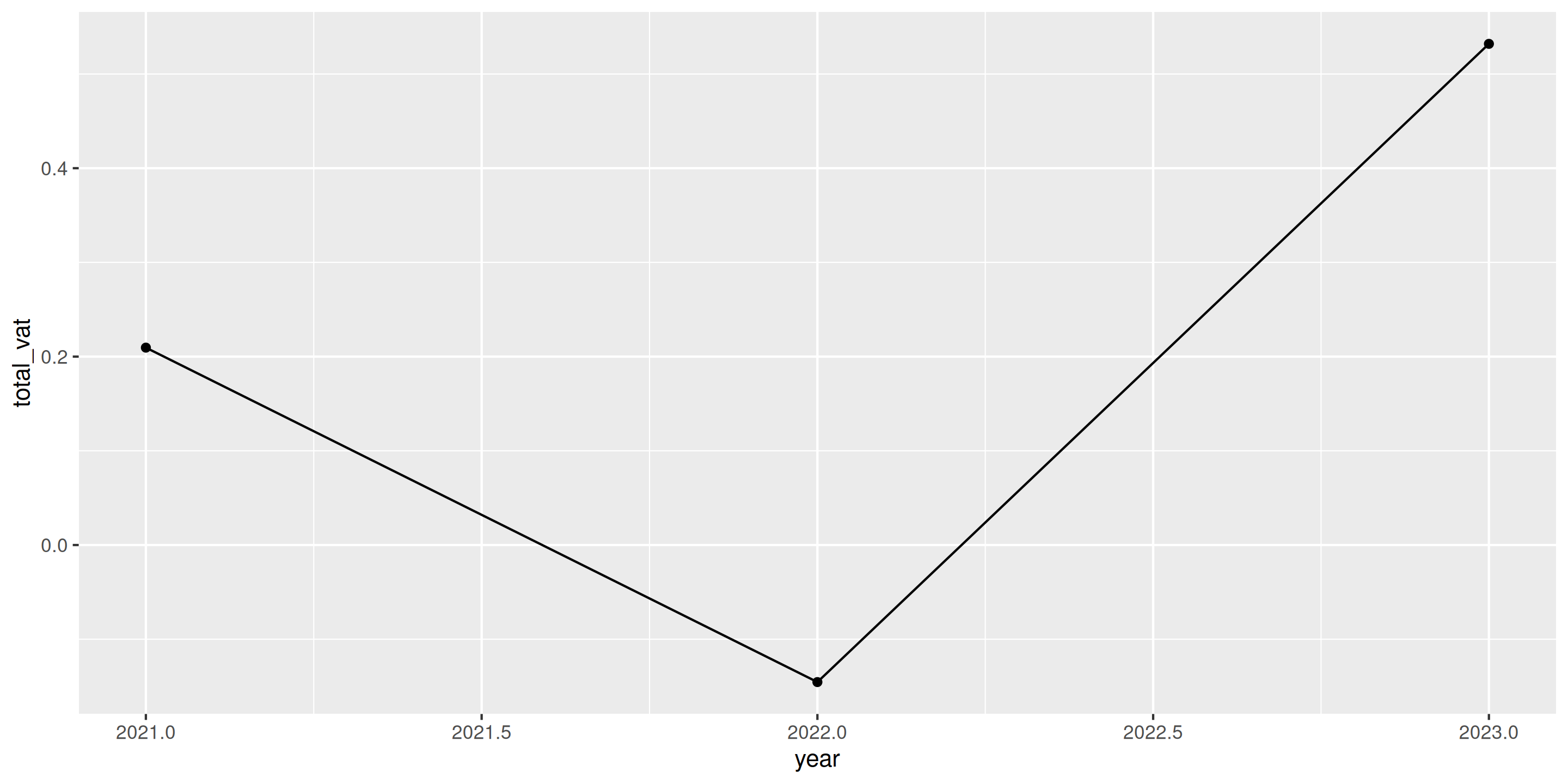
Best practice: Add geom_point() to show actual data points
Line Chart: Multiple Groups
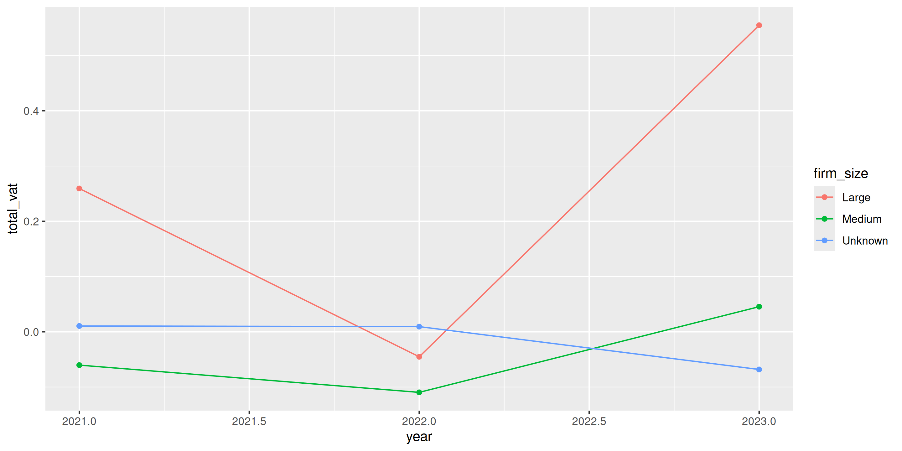
Color automatically creates separate lines for each group!
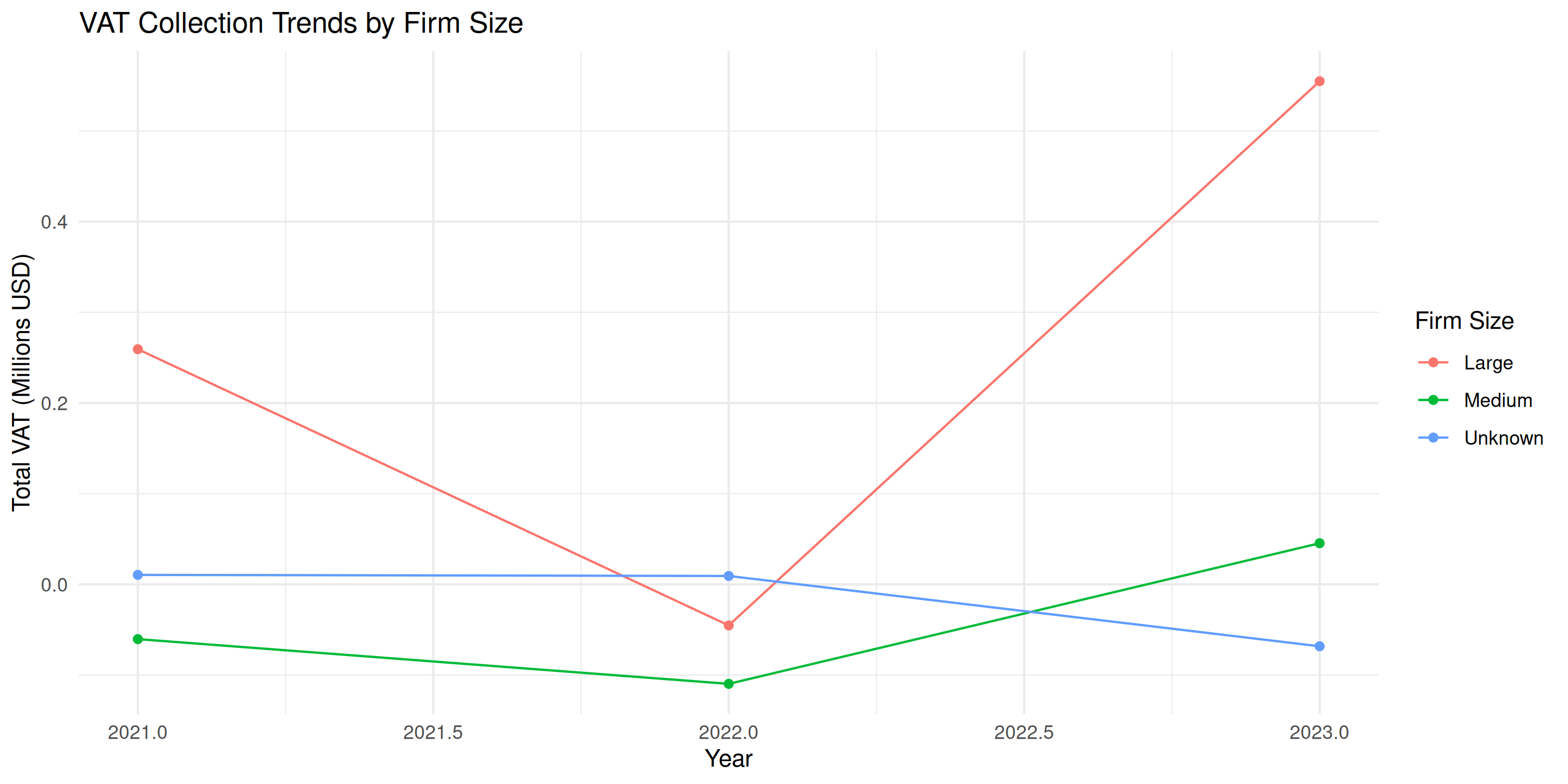
Line Chart: Professional Version
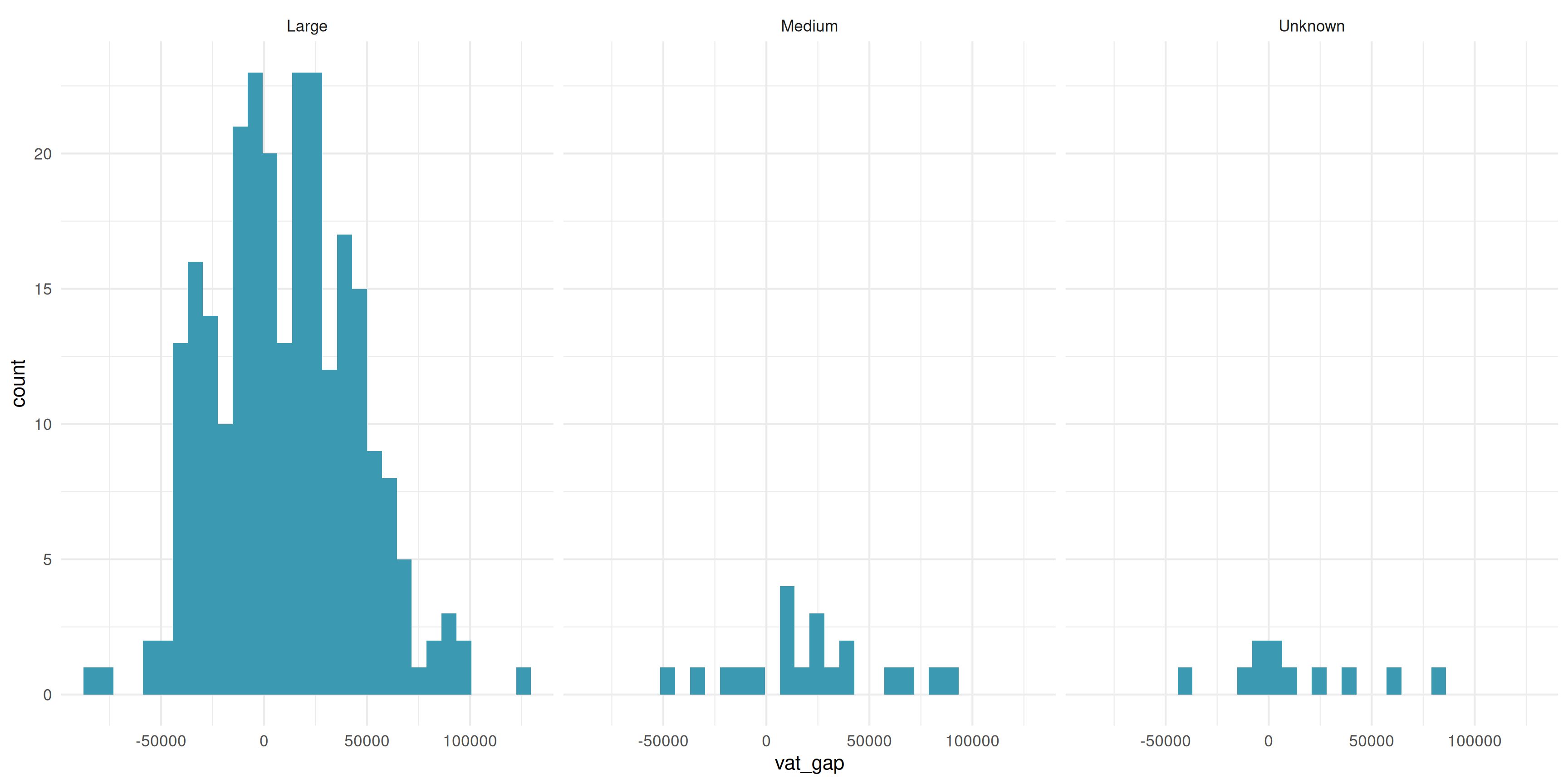
Faceting: Basic Example
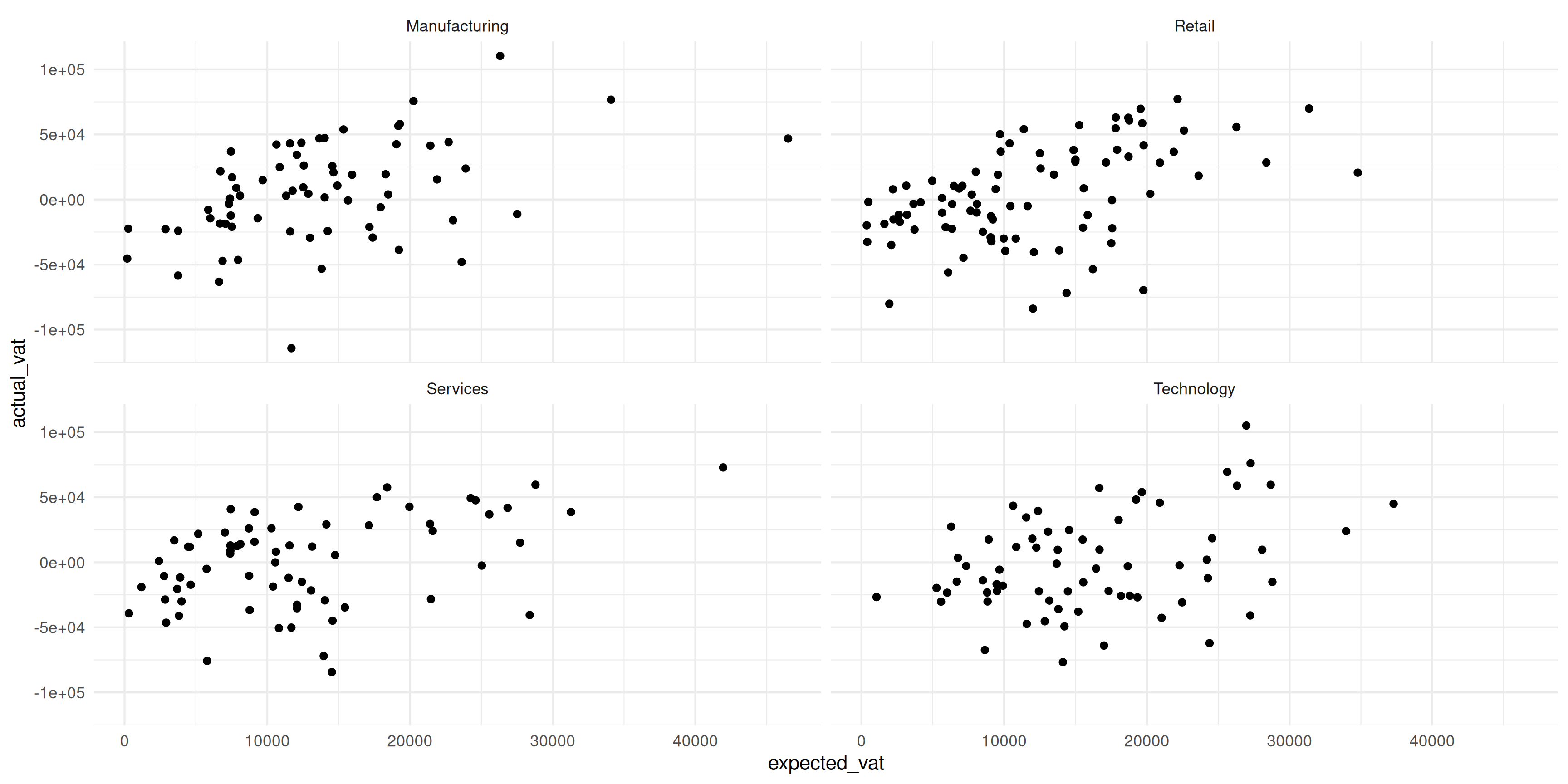
Each industry gets its own panel - much clearer!
Faceting: Control Layout
ncol = 3 controls number of columns
Labels: Make It Professional
Always include:
- Informative title
- Axis labels with units
- Data source
ggplot(vat_gap_analysis[1:100], aes(x = expected_vat/1000, y = actual_vat/1000)) +
  geom_point(aes(color = firm_size)) +
  labs(
    title = "VAT Compliance by Firm Size",
    subtitle = "Fiscal Years 2021-2023",
    x = "Expected VAT (Thousands USD)",
    y = "Actual VAT (Thousands USD)",
    color = "Firm Size",
    caption = "Source: Tax Administration Database"
  ) +
  theme_minimal()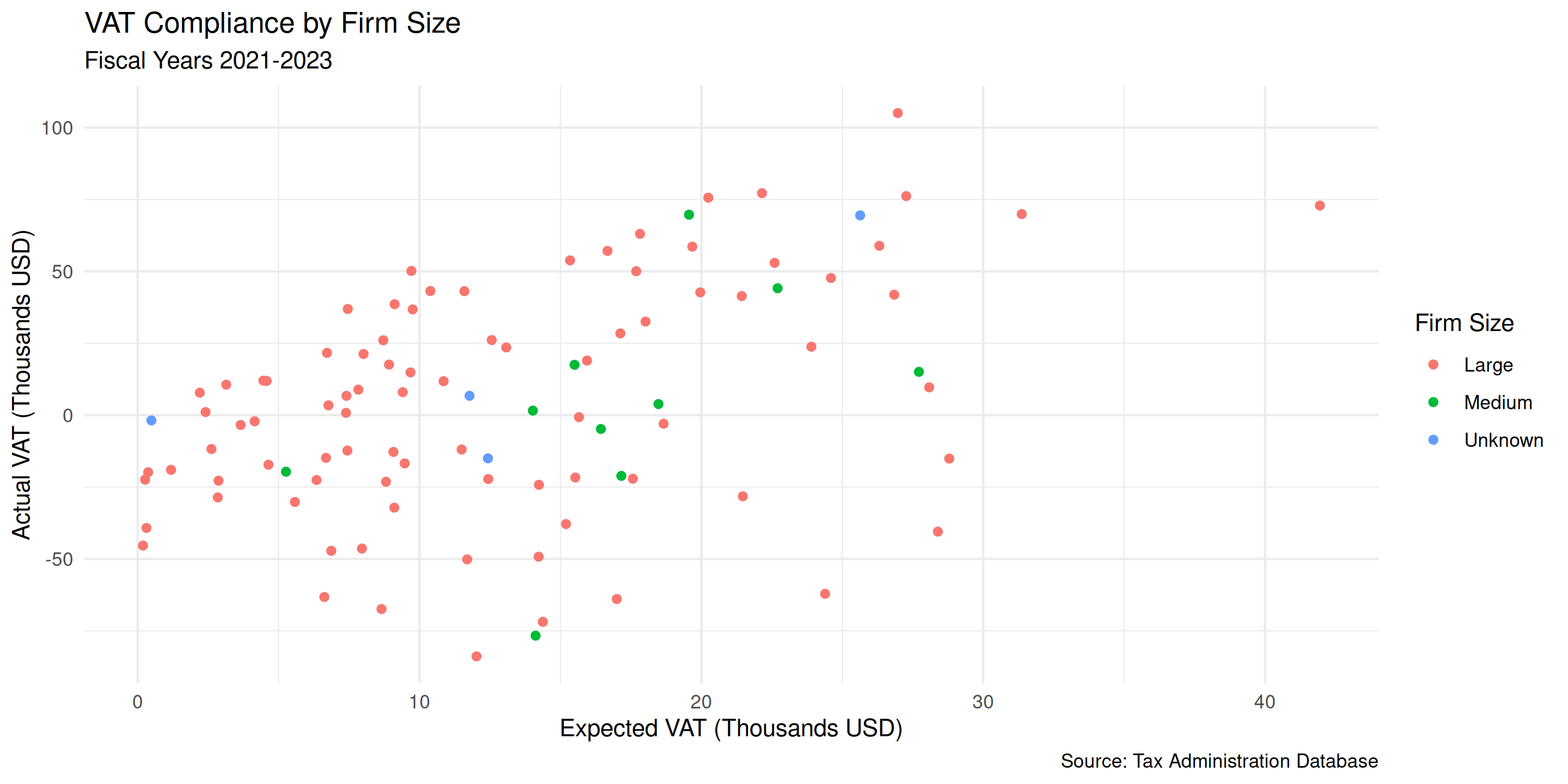
Themes: Clean Appearance
Recommended theme for reports:
theme_minimal() gives clean, modern look
Colors: Use Professional Palettes
ColorBrewer palettes: “Set1”, “Set2”, “Dark2” are good defaults